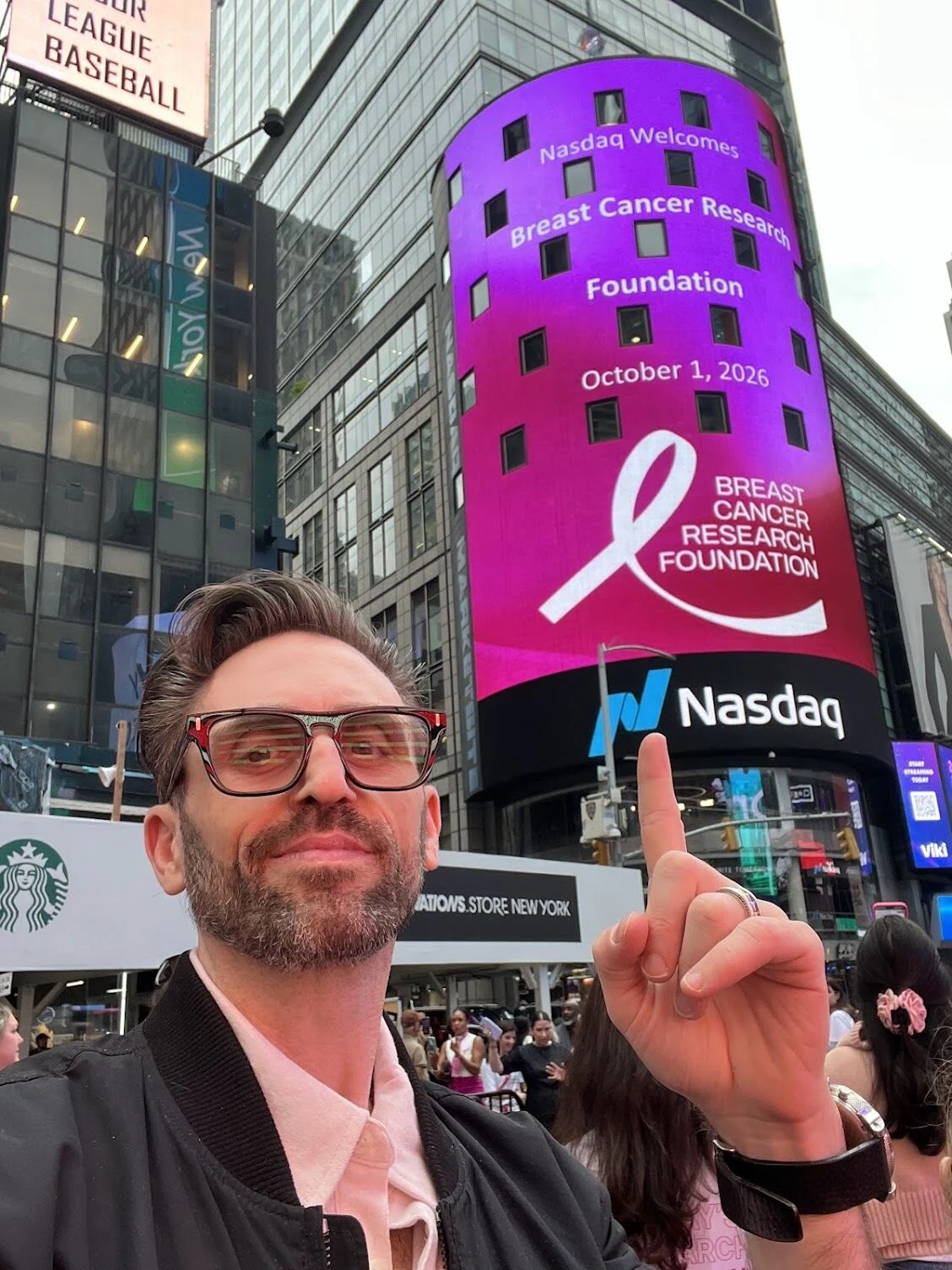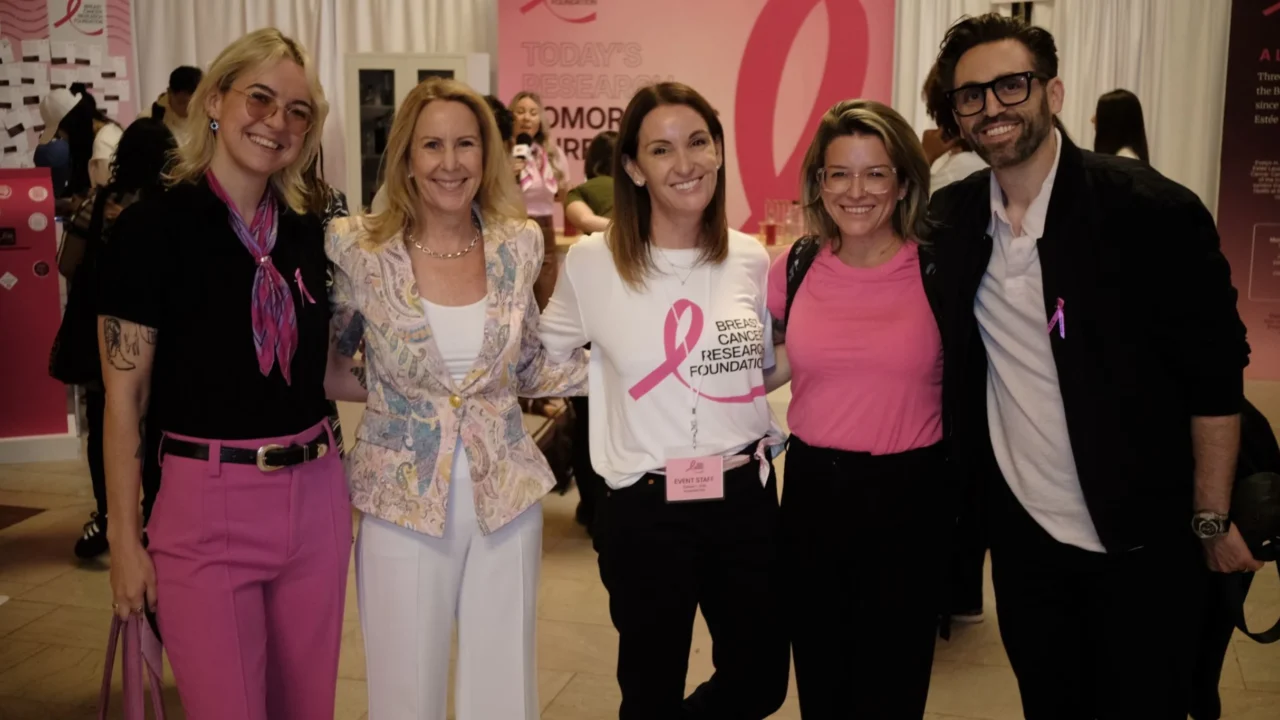
Jay Schacher, EVP, Executive Design Director at Klick, shared on LinkedIn:
“When a brand’s visual identity gets harder to distinguish in a crowded category, the answer isn’t always reinvention. Sometimes, it’s about reclaiming what made you distinctive in the first place, then making it ownable again.
Long-established brands carry recognition, history, emotional connection and trust. Their identities mean something to the people who know them. Any evolution has to create clearer distinction while protecting the equity the organization and its board are responsible for preserving.
The pink ribbon is a powerful example.
It is widely recognized as a symbol of breast cancer awareness. Evelyn H. Lauder helped make breast cancer awareness a visible public cause, and Estée Lauder’s distribution of 1.5 million pastel pink ribbons helped establish the colour as its global symbol.
The Breast Cancer Research Foundation (BCRF), founded by Lauder, brings its own history to that cause. It is the world’s largest private funder of breast cancer research, and BCRF-supported scientists have contributed to every major breakthrough in the field over the past three decades. Since its founding, BCRF has raised more than $1 billion to advance its mission.
Yet the ribbon has become the visual language of an entire category. As more organizations adopted it, it became harder for BCRF to stand apart within the movement it helped shape.
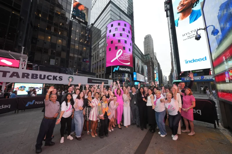
Working with the BCRF team, we returned to that history to address a clear design challenge: how to give the organization a more distinctive identity without losing the recognition and meaning of the pink ribbon. We elongated the ribbon’s familiar form, creating a visual asset that feels distinctly BCRF while also conveying forward movement.
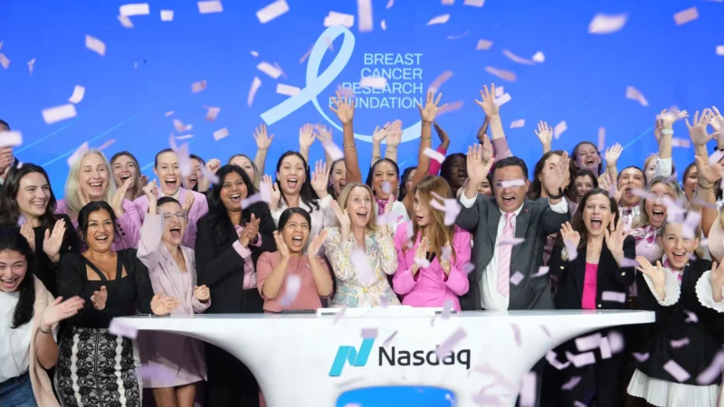
On October 1st, we proudly watched the new ribbon take over both Grand Central Station and Times Square as BCRF kicked off Breast Cancer Awareness Month at Nasdaq.
At the event, Donna McKay, President and CEO, put that progress into perspective, explaining how breast cancer was once approached as a single disease, while advances in research now recognize and target its many distinct forms. In the U.S., breast cancer mortality has fallen 44% since 1989, reflecting decades of progress in detection and treatment.
The ribbon reflects both how far we’ve come and the work still ahead to prevent and cure breast cancer.
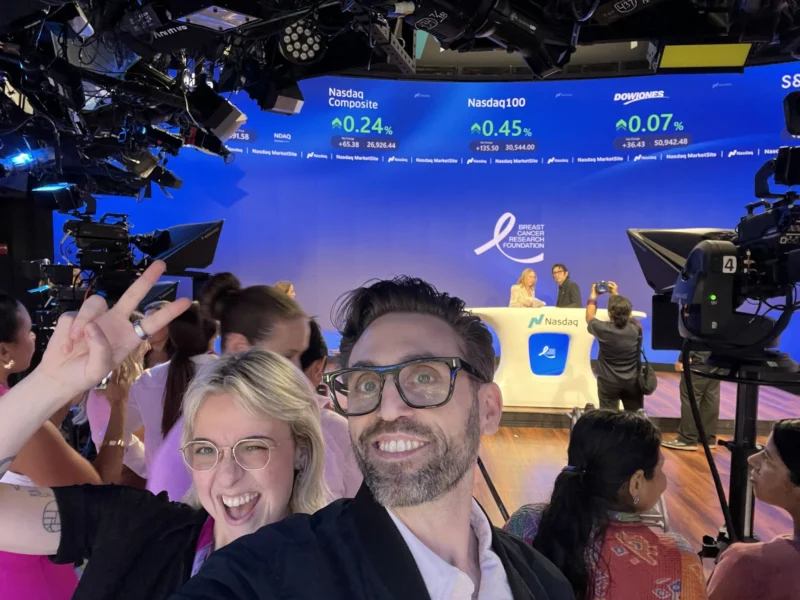
What stayed with me wasn’t just the scale. It was seeing survivors and families, colleagues and partners, executives and complete strangers rally around a cause that has touched so many lives. To me, that’s the opportunity in thoughtful brand evolution: using the equity built over time to guide what comes next.
Great identity design makes a brand recognizable. The best makes what it stands for unmistakable.
Thank you to Donna McKay and Jodi Patkin and the BCRF team for trusting us with an icon and for continuing to lead from the front.
Huge thanks to: Rich Levy, Leerom Segal, Jennifer White, Vicky Forsyth-Smith, Devon M. Taylor, Xhensila Zemblaku and Klick.”
This also can be interesting:
October Is Breast Cancer Awareness Month: Turning Awareness Into Earlier Diagnosis and Better Care