Tony Goldstone: So we need to talk about NHS pay
Tony Goldstone, Radiologist/CIO, National Clinician Adviser on Pay and Pensions (the BMA), Department Chair at BMA Pensions Committee, shared on X:
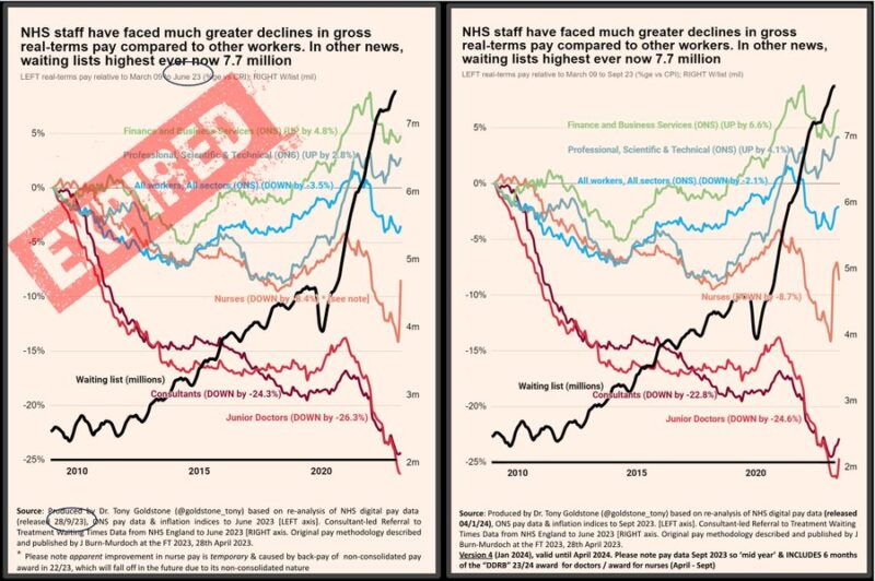
“NEW and IMPORTANT: So we need to talk about NHS pay. NEW shocking [post DDRB] data just in 4/1/24 (SPOILER: Not ‘fair and reasonable’).
We need to fix pay/retention to fix waiting lists- increasingly clear next GE will won/lost on NHS.
Please read whole thread and share widely/RT.
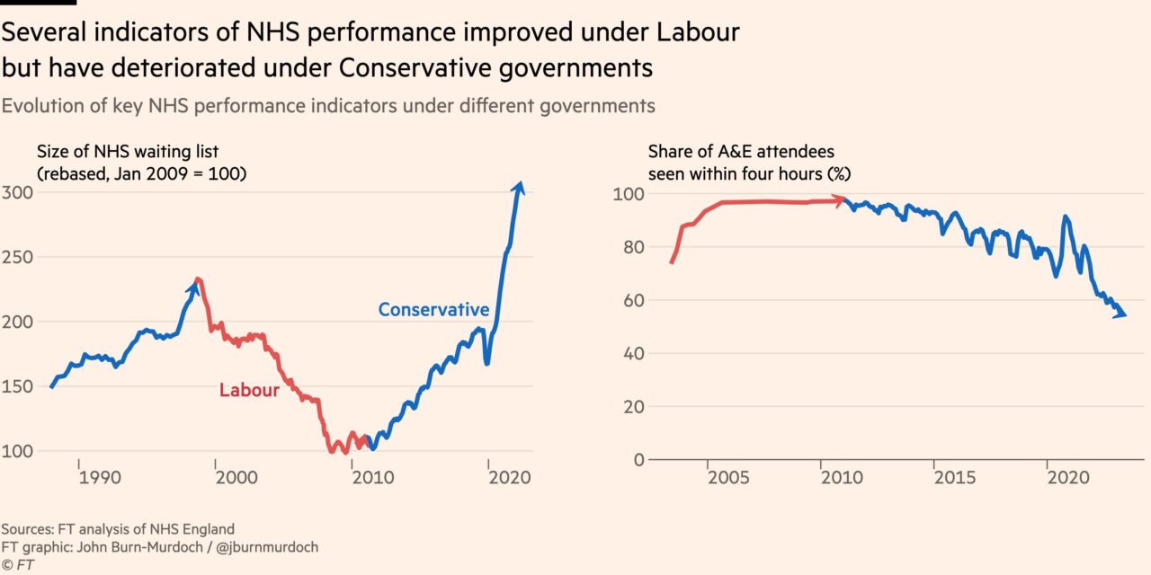
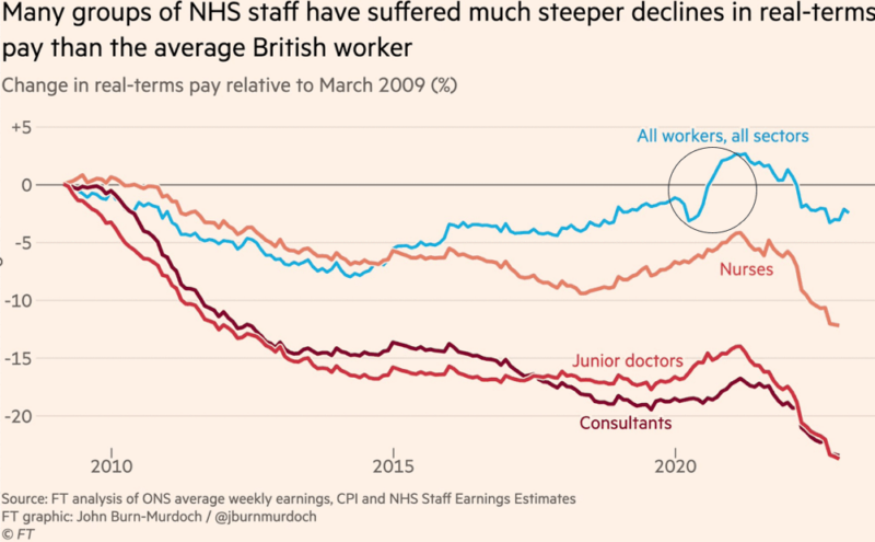
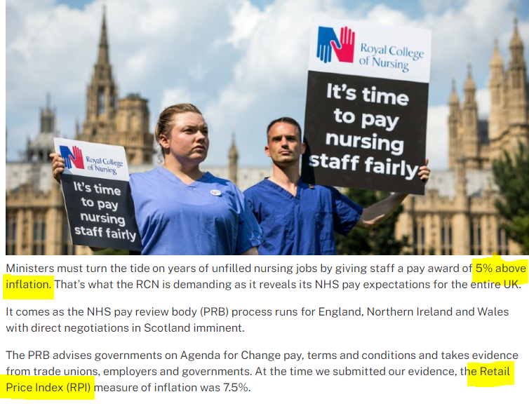
You’ll notice when ministers are in the media, they often talk about how hard ‘your viewers/listeners’ have been hit by inflation. But what we need to do is separate fact from fiction (aka LIES), and it was chart from excellent John Burn-Murdoch, Financial Times that really showed this well.
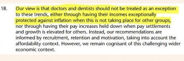
But its not just government ministers gaslighting NHS workers that they have no right for their pay to keep up (like everyone else’s), its also the so-called ‘independent’ DDRB.
Apparently doctors and dentists should not be protected when ‘its not taking place in other groups’.
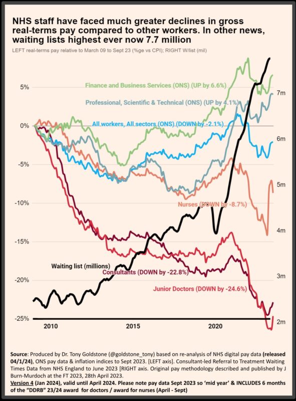
Like many people I found the Financial Times charts extremely compelling. There are many different ways to measure pay loss, but I wondered if I could add consultants to the charts which I did – JBM kindly provided a graph to compare and as you can see they were essentially identical.
There’s a small difference (circled) in ‘all workers all sectors’ (an Office for National Statistics (ONS) dataset) during the initial phase of COVID as I have chosen to average pay each month over the prior 12 month period (to better match the NHS England Digital Earnings Estimates methodology) = fairer comparison.
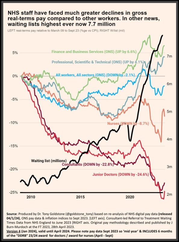
As with the now expired charts I previously produced (they went to June’23 as that was then most recent data set) I added some other comparators, perhaps more appropriate for NHS i.e. professional, technical and scientific – a much better and fairer comparator for NHS staff.
Its worth pointing out that *ALL* the variables in these charts are *official statistics*. Its either pay or inflation from the ONS (comparables), NHS pay and waiting list data from NHS England.
Average pay is chosen as that is what’s used by government. And most commentators.
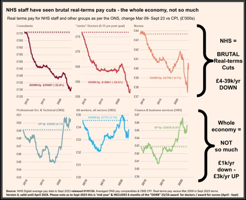
The bottom line in those charts is that NHS pay had been *COMPLETELY DESTROYED* compared to 2009, but the whole economy fared pretty well vs CPI inflation, the most commonly used measure of “headline inflation” which is generally preferred by government and economists.
Taking each group (NEW Sept 23 vs OLD June 23 as previously)
Finance and Bus. +6.6%,prev+4.8%
Prof Sci and Techn +4.1%, prev+2.8%
All workers, All sectors -2.1%,prev-3.5%
Nurses -8.7%,prev-8.4%
Junior Doctors -24.3%, prev-26.3%
Consultants -22.8%, prev -24.3%
Nurses had a * next to their line previously, their apparent rise due to a non-consolidated payment. Now thats starting to fall again as it was a non-recurrent bonus.
So what do those pay cuts actually mean for real terms pay had it kept up with even CPI (and there is a *STRONG* argument for using RPI which is also very valid, for example as it includes mortgage interest payments). It means NHS staff pay has been BRUTALLY cut.
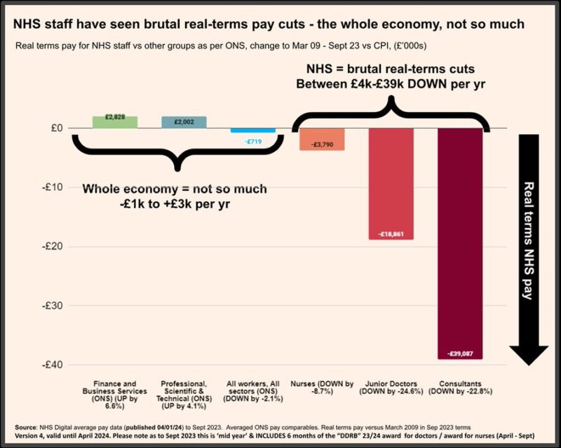
Compare that to the “whole economy” and the differences are simply flabbergasting.
NHS = BRUTAL Real-terms Cuts – £4-39k/ each and every year DOWN
Whole economy = NOT so much – £0.7k/yr down – £3k/yr UP
Please *ANY* politician tell me this is “FAIR” or REASONABLE
Or maybe someone from the Bank of England pipe up and tell us inflation “hurt” us all, and we should show ‘restraint’.
I think the public sector, and the NHS has been ‘restrained’ a little too tightly, don’t you?
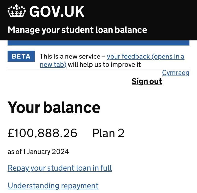
As noted above, I have used CPI for these charts essentially because that is what the government prefers to use (when it suits them, not in student loans where they use RPI which generally runs higher). Often £100k+ for med students. Disgraceful double standards.
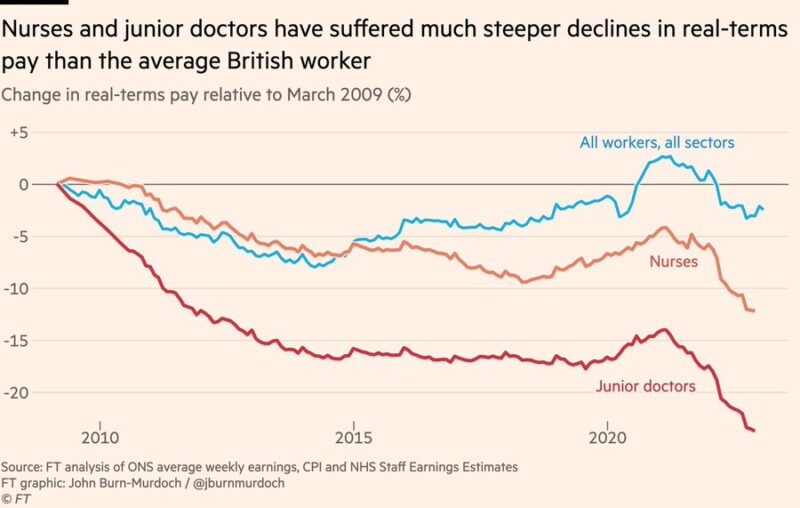
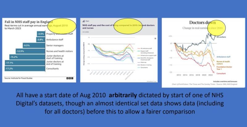
With the exception of the outstanding JBM at the Financial Times, who starts his pay charts at the start of ‘austerity’ (which was when serious pay erosion started), all others arbitrarily choose Aug 2010 as a start as this is when one of the NHS digital data sets starts.
So coming back to my first tweet, we kept on being told that the “independent” DDRB offer was “fair and reasonable”.
Whats interesting about yesterday’s data to September is that it includes DDRB backpay for half the year. These graphs do NOT look fair and reasonable to me!!!
They have done virtually nothing to restore our pay, as predicted – and this is using CPI, not RPI used by the BMA and in fact all major unions. Those DDRB awards form the starting point for both the juniors, SAS and consultants offers – basically DDRB plus 3% investment.
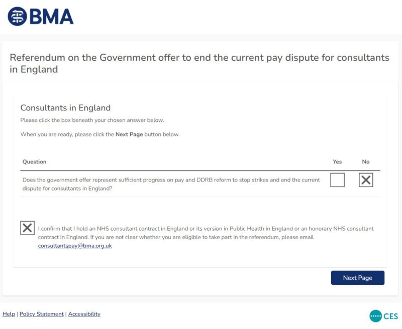
As a consultant myself, I was waiting on yesterday’s pay data before deciding how to vote. I encourage all of you to read all the excellent material in the post and online. Please make up your own mind, but *DO* vote. For me, today, it was a NO.
For everyone it will be different, but for me it boiled down to 2 main reasons for me (but please make up your own mind)
- The total investment was too low. Noone is expecting pay restoration in 1 year realistically, but as per my graphs DDRB barely touched the sides, so DDRB+3% won’t help enough [and I would want it spread more evenly, but do consider the long term from pay scale reform]
- DDRB changes are a step in the right direction, but it’s not enough for me i.e. re’affordability’ In fact nowhere near. DDRB alongside government destroyed our pay. Until they recognise what these graphs show, and are told to fix it, I don’t have confidence they will as per
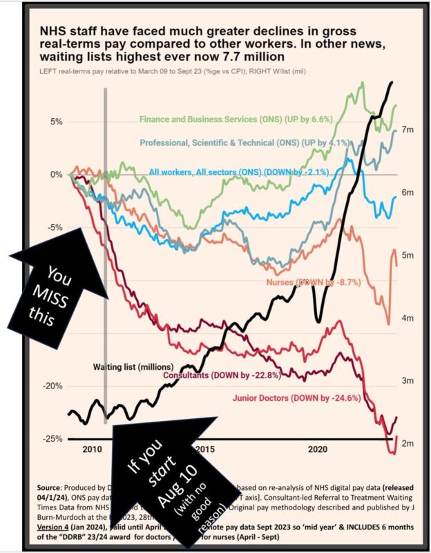
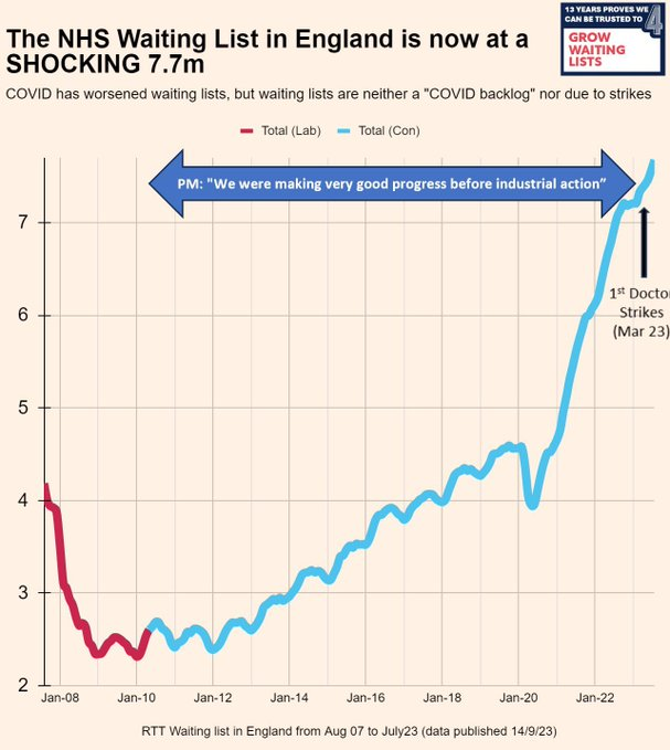
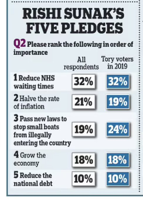
A poll recently (even by the pro-conservative government Daily Mail), showed the most important of Rishi Sunak‘s 5 priorities – by FAR – is REDUCE WAITING TIMES – even amongst Tory voters in 2019. Those waiting list are really zip all to do with strikes (look at the chart).
The NHS’s most valuable commodity is its staff. And how those staff are valued by you is a political choice.
Just like waiting lists – its a political choice to fund the NHS (and its staff) adequately, or allow it to go into terminally decline.
Voters are watching.
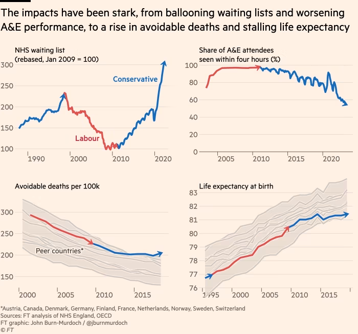

Our NHS is in a DIRE state. None of this is due to striking NHS workers, or (just) covid, but due to political choices UK Prime Minister.
RT if you want this (or the next) government to make the choices to fix this mess now and properly.
POSTCRIPT – I’ve had a few requests for the chart without the waiting list. I used to produce this regularly but I think the waiting lists are intrinsically connected via RETENTION but here it is for clarity of the APPALLING pay erosion.”
Video attached in the post.
Additional details.
Source: Tony Goldstone/X